


Insite Mobile App Launch
Turning Complex Operations Into Clear Stories
Problem
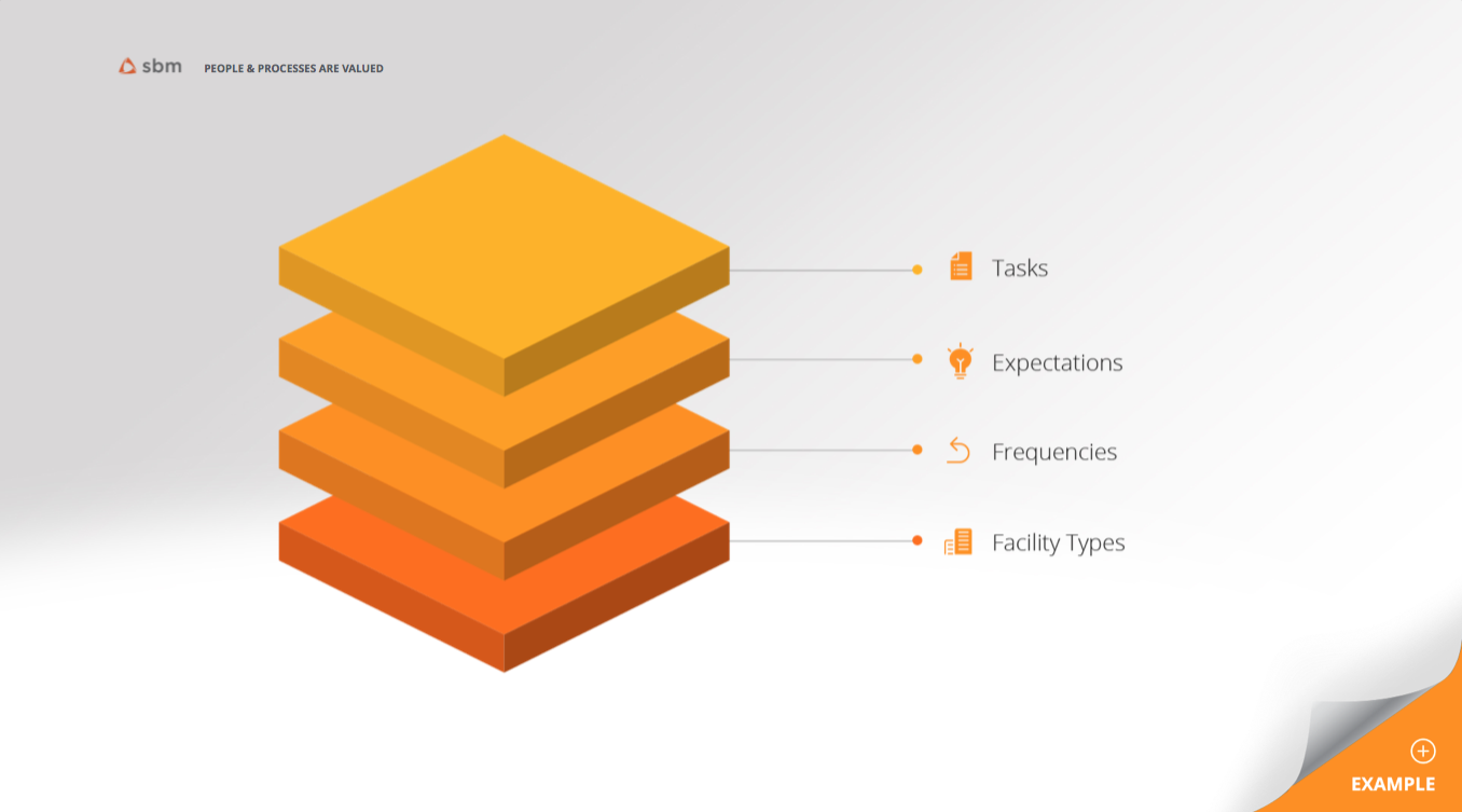
The Insite Mobile App needed launch materials that clearly communicated how the platform organizes and streams daily facility tasks and projects — while strictly adhering to existing company brand guidelines.
The challenge was translating complex operational workflows into messaging that was clear, credible, and easy to understand for internal and external audiences.
Solution
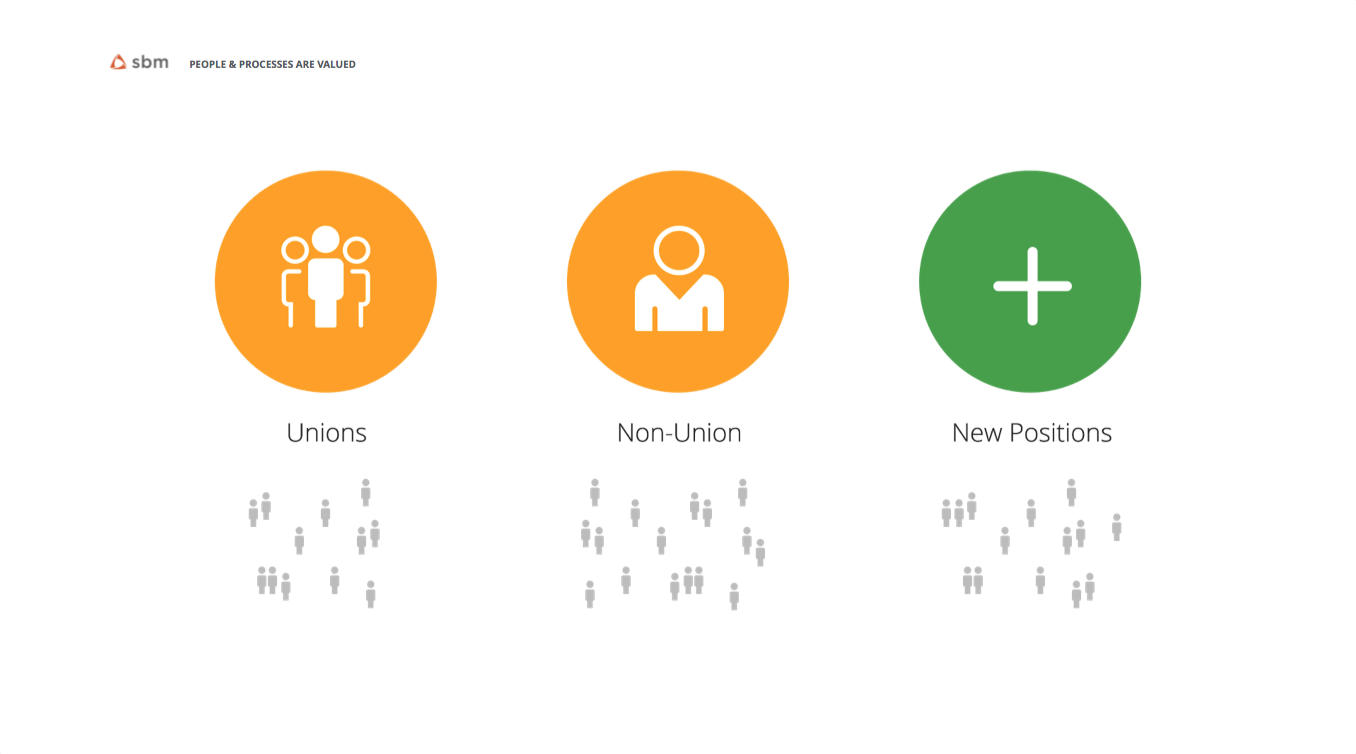
I designed a set of presentation slides and posters that used brand-approved typography, color, and layout systems to visually explain the app’s core value. Information was structured around real workflows, highlighting how tasks, projects, and teams connect inside the app.
The focus was on clarity over decoration — showing how the product works, not just what it is.
Outcome
Launch materials that aligned with brand standards while making a complex product feel approachable, organized, and purposeful.
Key Insight
Great product design communication turns operational complexity into instant understanding.